Implementing the accounts component
Overview
This guide will walk you through the process of implementing a new component that lists all the accounts in your tenant. This serves as an example you can use to learn how to implement many different types of custom UI pages.
This guide is a continuation of Getting Started. At the end of this guide, you will be able to do the following:
- List all accounts in your tenant
- Paginate accounts by page limits of 10, 25, 50, 100
- Click through each page of results
- View the JSON response of the account from your tenant
- Sort the results, using the sort syntax on the List Accounts endpoint.
- Filter the results, using the filter syntax on the List Accounts endpoint.
Create the accounts component
Create the accounts component by running the following command in the root of the project:
npm run generate:component accounts
This command will create a new folder in the projects/sailpoint-components/src/lib directory with the name accounts. It will also create the following files:
accounts.component.htmlaccounts.component.tsaccounts.component.scssaccounts.component.spec.ts
The output will look similar to this:
tyler.mairose ~/development/ui-development-kit [main] $ npm run generate:component accounts

> sailpoint-ui-development-kit@1.0.0 generate:component
> node scripts/generate-component.js accounts

🚀 Generating component: accounts
✅ Created directory: /Users/tyler.mairose/development/ui-development-kit/projects/sailpoint-components/src/lib/accounts
✅ Created: accounts.component.ts
✅ Created: accounts.component.html
✅ Created: accounts.component.scss
✅ Created: accounts.component.spec.ts
✅ Updated: component-selector.service.ts
✅ Updated: app.routes.ts
✅ Updated: app.component.html
✅ Updated: public-api.ts
🎉 Component 'accounts' generated successfully!
📝 Next steps:
   1. Build the project: npm run start
   2. Enable the component in the component selector
   3. Implement your component logic in: /Users/tyler.mairose/development/ui-development-kit/projects/sailpoint-components/src/lib/accounts
Enable the accounts component
To enable the accounts component, open the component selector and toggle the accounts component on. You can do this by clicking on the "Component Selector" tab in the sidebar.
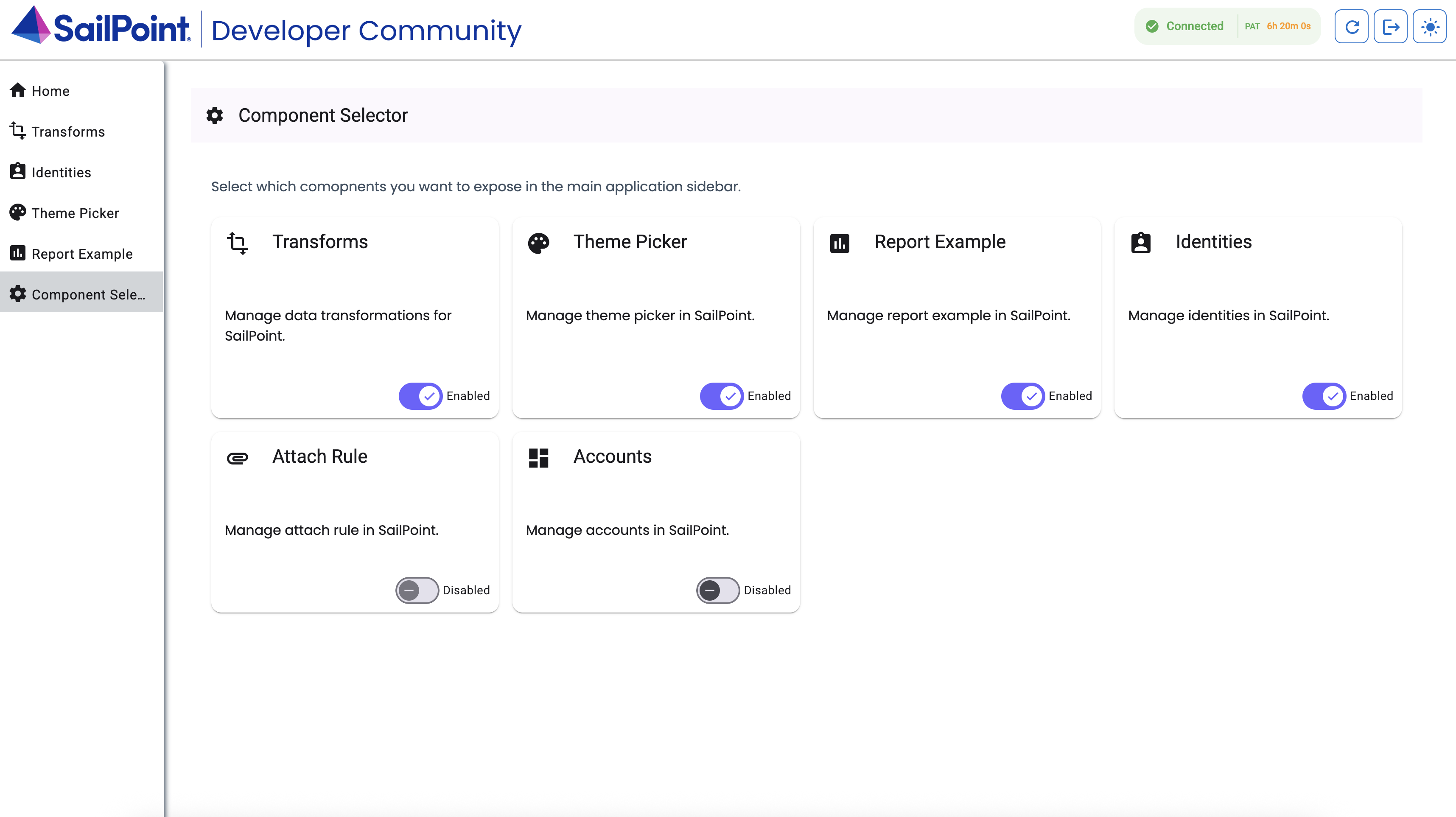
You will see the accounts component in the list of available components. Toggle the accounts component on to enable it.
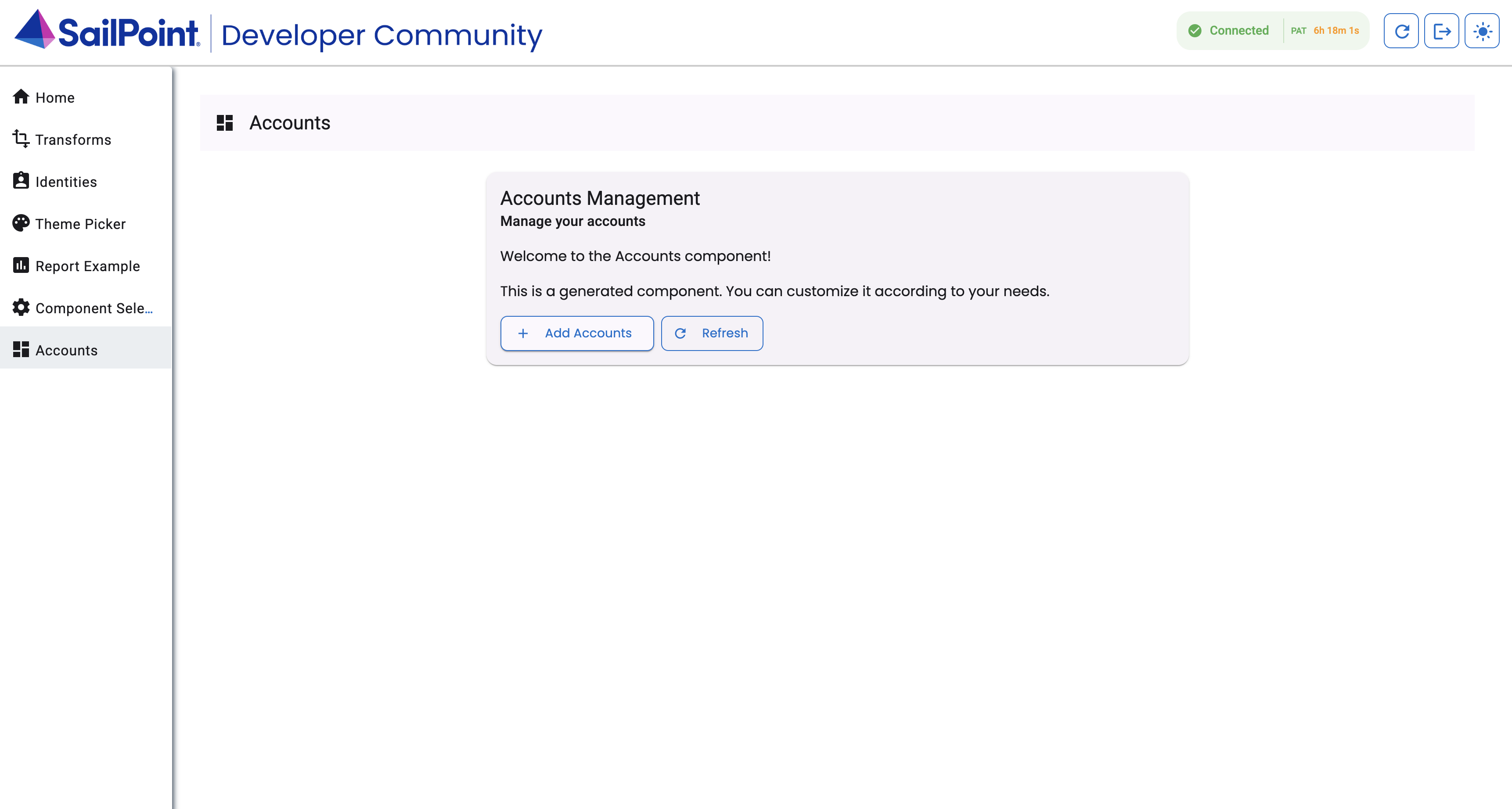
Once enabled you will see the accounts component in the sidebar. You can click on it to navigate to the accounts page.
Get account data
The first thing your new component needs to do is get the account data to show. You can implement this by using the List Accounts endpoint.
To do so, add this logic to the typescript file at projects/sailpoint-components/src/lib/accounts/accounts.component.ts:
import { CommonModule } from '@angular/common';
import { Component, OnInit } from '@angular/core';
import { MatButtonModule } from '@angular/material/button';
import { MatCardModule } from '@angular/material/card';
import { MatIconModule } from '@angular/material/icon';
import { MatTableModule } from '@angular/material/table';
import { MatToolbarModule } from '@angular/material/toolbar';
import { MatProgressSpinnerModule } from '@angular/material/progress-spinner';
import { MatPaginatorModule } from '@angular/material/paginator';
import { SailPointSDKService } from '../sailpoint-sdk.service';
import { AccountV2025 } from 'sailpoint-api-client';

@Component({
  selector: 'app-accounts',
  standalone: true,
  imports: [
    CommonModule,
    MatButtonModule,
    MatCardModule,
    MatIconModule,
    MatTableModule,
    MatToolbarModule,
    MatProgressSpinnerModule,
    MatPaginatorModule
  ],
  templateUrl: './accounts.component.html',
  styleUrl: './accounts.component.scss',
})
export class AccountsComponent implements OnInit {
  title = 'Accounts';
  loading = true;
  accounts: AccountV2025[] = [];
  displayedColumns: string[] = ['id', 'name', 'nativeIdentity', 'sourceId', 'disabled', 'locked', 'actions'];

  constructor(private sdk: SailPointSDKService) {}

  ngOnInit() {
    // Load initial data
    void this.loadAccounts();
  }

  private async loadAccounts() {
    this.loading = true;
    try {
      const response = await this.sdk.listAccounts();
      this.accounts = response.data as AccountV2025[];
      console.log('Loaded accounts:', this.accounts);
    } catch (error) {
      console.error('Error loading accounts:', error);
    } finally {
      this.loading = false;
    }
  }

  viewAccount(account: AccountV2025): void {
    console.log('Viewing account:', account);
  }
}
Return to your accounts list page. In the electron app, click View -> Toggle Developer Tools. You will see the response containing the accounts in the console after the page loads.
Now that you have your account data, you need to display the data. You can add a table to the UI and display your results.
To do so, add this code to \accounts\accounts.component.html:
Show code
<div class="accounts-container">
  <mat-toolbar color="primary">
    <mat-icon>account_box</mat-icon>
    <span class="toolbar-title">{{ title }}</span>
  </mat-toolbar>

  <div class="content">
    <!-- Loading spinner -->
    <div *ngIf="loading" class="spinner-container">
      <mat-spinner diameter="75"></mat-spinner>
    </div>

    <div *ngIf="!loading" class="table-container">
      <!-- Accounts table -->
      <table mat-table [dataSource]="accounts" class="mat-elevation-z8" *ngIf="accounts.length">
        <!-- ID Column -->
        <ng-container matColumnDef="id">
          <th mat-header-cell *matHeaderCellDef>ID</th>
          <td mat-cell *matCellDef="let account">{{ account.id }}</td>
        </ng-container>

        <!-- Name Column -->
        <ng-container matColumnDef="name">
          <th mat-header-cell *matHeaderCellDef>Name</th>
          <td mat-cell *matCellDef="let account">{{ account.name || '-' }}</td>
        </ng-container>

        <!-- Native Identity Column -->
        <ng-container matColumnDef="nativeIdentity">
          <th mat-header-cell *matHeaderCellDef>Native Identity</th>
          <td mat-cell *matCellDef="let account">{{ account.nativeIdentity || '-' }}</td>
        </ng-container>

        <!-- Source ID Column -->
        <ng-container matColumnDef="sourceId">
          <th mat-header-cell *matHeaderCellDef>Source</th>
          <td mat-cell *matCellDef="let account">{{ account.sourceId || '-' }}</td>
        </ng-container>

        <!-- Disabled Column -->
        <ng-container matColumnDef="disabled">
          <th mat-header-cell *matHeaderCellDef>Disabled</th>
          <td mat-cell *matCellDef="let account">
            <mat-icon *ngIf="account.disabled">check_circle</mat-icon>
            <mat-icon *ngIf="!account.disabled">cancel</mat-icon>
          </td>
        </ng-container>

        <!-- Locked Column -->
        <ng-container matColumnDef="locked">
          <th mat-header-cell *matHeaderCellDef>Locked</th>
          <td mat-cell *matCellDef="let account">
            <mat-icon *ngIf="account.locked">lock</mat-icon>
            <mat-icon *ngIf="!account.locked">lock_open</mat-icon>
          </td>
        </ng-container>

        <!-- Actions Column -->
        <ng-container matColumnDef="actions">
          <th mat-header-cell *matHeaderCellDef>Actions</th>
          <td mat-cell *matCellDef="let account">
            <button mat-button color="primary" (click)="viewAccount(account)">
              <mat-icon>visibility</mat-icon> View
            </button>
          </td>
        </ng-container>

        <tr mat-header-row *matHeaderRowDef="displayedColumns"></tr>
        <tr mat-row *matRowDef="let row; columns: displayedColumns;"></tr>
      </table>

      <!-- No data message -->
      <div *ngIf="accounts.length === 0" class="no-data-message">
        No accounts found.
      </div>
    </div>
  </div>
</div>
Save the \accounts\accounts.component.html file and return to the accounts list page. You will see up to 250 accounts in the table.
Pagination
You will likely have more than 250 accounts in your tenant. To handle more than 250 accounts, you must implement pagination on your front end page. Pagination is the process of paging through your records. With pagination, you can handle 1000 accounts in 4 pages of 250, for example.
To implement pagination, add the following code. This code allows you to paginate accounts in groups of 5, 10, 50, 100 and 250, depending on your requirement:
The highlighted portions of the code are the changes made to the previous code to allow pagination.
- \accounts\accounts.component.html
- \accounts\accounts.component.ts
<div class="accounts-container">
  <mat-toolbar color="primary">
    <mat-icon>account_box</mat-icon>
    <span class="toolbar-title">{{ title }}</span>
  </mat-toolbar>

  <div class="content">
    <!-- Loading spinner -->
    <div *ngIf="loading" class="spinner-container">
      <mat-spinner diameter="75"></mat-spinner>
    </div>

    <div *ngIf="!loading" class="table-container">
      <!-- Accounts table -->
      <table mat-table [dataSource]="accounts" class="mat-elevation-z8" *ngIf="accounts.length">
        <!-- ID Column -->
        <ng-container matColumnDef="id">
          <th mat-header-cell *matHeaderCellDef>ID</th>
          <td mat-cell *matCellDef="let account">{{ account.id }}</td>
        </ng-container>

        <!-- Name Column -->
        <ng-container matColumnDef="name">
          <th mat-header-cell *matHeaderCellDef>Name</th>
          <td mat-cell *matCellDef="let account">{{ account.name || '-' }}</td>
        </ng-container>

        <!-- Native Identity Column -->
        <ng-container matColumnDef="nativeIdentity">
          <th mat-header-cell *matHeaderCellDef>Native Identity</th>
          <td mat-cell *matCellDef="let account">{{ account.nativeIdentity || '-' }}</td>
        </ng-container>

        <!-- Source ID Column -->
        <ng-container matColumnDef="sourceId">
          <th mat-header-cell *matHeaderCellDef>Source</th>
          <td mat-cell *matCellDef="let account">{{ account.sourceId || '-' }}</td>
        </ng-container>

        <!-- Disabled Column -->
        <ng-container matColumnDef="disabled">
          <th mat-header-cell *matHeaderCellDef>Disabled</th>
          <td mat-cell *matCellDef="let account">
            <mat-icon *ngIf="account.disabled">check_circle</mat-icon>
            <mat-icon *ngIf="!account.disabled">cancel</mat-icon>
          </td>
        </ng-container>

        <!-- Locked Column -->
        <ng-container matColumnDef="locked">
          <th mat-header-cell *matHeaderCellDef>Locked</th>
          <td mat-cell *matCellDef="let account">
            <mat-icon *ngIf="account.locked">lock</mat-icon>
            <mat-icon *ngIf="!account.locked">lock_open</mat-icon>
          </td>
        </ng-container>

        <!-- Actions Column -->
        <ng-container matColumnDef="actions">
          <th mat-header-cell *matHeaderCellDef>Actions</th>
          <td mat-cell *matCellDef="let account">
            <button mat-button color="primary" (click)="viewAccount(account)">
              <mat-icon>visibility</mat-icon> View
            </button>
          </td>
        </ng-container>

        <tr mat-header-row *matHeaderRowDef="displayedColumns"></tr>
        <tr mat-row *matRowDef="let row; columns: displayedColumns;"></tr>
      </table>

      <!-- Paginator -->
      <mat-paginator
        [length]="totalCount"
        [pageSize]="pageSize"
        [pageIndex]="pageIndex"
        [pageSizeOptions]="[5, 10, 25, 100, 250]"
        (page)="onPageChange($event)"
        showFirstLastButtons
        aria-label="Select page of accounts">
      </mat-paginator>

      <!-- No data message -->
      <div *ngIf="accounts.length === 0" class="no-data-message">
        No accounts found.
      </div>
    </div>
  </div>
</div>
import { CommonModule } from '@angular/common';
import { Component, OnInit, ViewChild } from '@angular/core';
import { MatButtonModule } from '@angular/material/button';
import { MatCardModule } from '@angular/material/card';
import { MatIconModule } from '@angular/material/icon';
import { MatTableModule } from '@angular/material/table';
import { MatToolbarModule } from '@angular/material/toolbar';
import { MatProgressSpinnerModule } from '@angular/material/progress-spinner';
import { MatPaginator, MatPaginatorModule, PageEvent } from '@angular/material/paginator';
import { SailPointSDKService } from '../sailpoint-sdk.service';
import { AccountV2025 } from 'sailpoint-api-client';

@Component({
  selector: 'app-accounts',
  standalone: true,
  imports: [
    CommonModule,
    MatButtonModule,
    MatCardModule,
    MatIconModule,
    MatTableModule,
    MatToolbarModule,
    MatProgressSpinnerModule,
    MatPaginatorModule
  ],
  templateUrl: './accounts.component.html',
  styleUrl: './accounts.component.scss',
})
export class AccountsComponent implements OnInit {
  title = 'Accounts';
  loading = true;
  accounts: AccountV2025[] = [];
  displayedColumns: string[] = ['id', 'name', 'nativeIdentity', 'sourceId', 'disabled', 'locked', 'actions'];


  // Pagination settings
  pageSize = 10;
  pageIndex = 0;
  totalCount = 0;

  @ViewChild(MatPaginator) paginator!: MatPaginator;


  constructor(private sdk: SailPointSDKService) {}

  ngOnInit() {
    // Load initial data
    void this.loadAccounts();
  }

  async loadAccounts() {
    // Setup request for paged account results
    const request = {
      offset: this.pageIndex * this.pageSize,
      limit: this.pageSize,
      count: true,
      sorters: undefined,
      filters: undefined
    };

    this.loading = true;
    try {
      const response = await this.sdk.listAccounts(request);
      this.accounts = response.data;

      // Get total count from headers if available
      let count: number | undefined;
      if (response.headers && typeof (response.headers as any).get === 'function') {
        const headerValue = (response.headers as any).get('X-Total-Count');
        count = headerValue ? Number(headerValue) : undefined;
      } else if (response.headers && typeof (response.headers as any)['x-total-count'] !== 'undefined') {
        count = Number((response.headers as any)['x-total-count']);
      }

      this.totalCount = count ?? 250; // Default to 250 if count not available
      console.log('Loaded accounts:', this.accounts);
    } catch (error) {
      console.error('Error loading accounts:', error);
    } finally {
      this.loading = false;
    }
  }

  // Handle page change events
  onPageChange(event: PageEvent) {
    this.pageSize = event.pageSize;
    this.pageIndex = event.pageIndex;
    void this.loadAccounts();
  }

  viewAccount(account: AccountV2025): void {
    console.log('Viewing account:', account);
  }
}
Return to the accounts list page. You will see the paginator at the bottom of the page. You can now paginate through the accounts in your tenant.
Viewing Details
In this step, we will create a detail view to see the raw json object that represents the underlying data.
To do this, we will implement the already existing viewAccount method to use the GenericDialogComponent that comes with the UI Development Kit. The only thing to change here is just to implement the method as seen below:
  viewAccount(account: AccountV2025): void {
    // Format account details as JSON string with indentation
    const details = JSON.stringify(account, null, 2);

    // Open dialog with account details
    this.dialog.open(GenericDialogComponent, {
      minWidth: '800px',
      data: {
        title: `Account Details: ${account.name || account.nativeIdentity || account.id}`,
        message: details
      }
    });
  }
Note that we also need to add the dialog to the constructor:
constructor(private sdk: SailPointSDKService, private dialog: MatDialog) {}
And also add the imports:
import { MatDialog } from '@angular/material/dialog';
import { GenericDialogComponent } from '../generic-dialog/generic-dialog.component';
Sort and filter
The last part of the page we may want to implement would be sorting and filtering.
With this implementation, the this.filterForm.valueChanges event and onSortChange event will cause the page to reload the accounts with the new sort or filter applied.
The completed component and all code can be seen below:
- \accounts\accounts.component.html
- \accounts\accounts.component.ts
- \accounts\accounts.component.css
<div class="accounts-container">
  <mat-toolbar color="primary">
    <mat-icon>account_box</mat-icon>
    <span class="toolbar-title">{{ title }}</span>
  </mat-toolbar>

  <div class="content">
    <!-- Filter panel -->
    <div class="filter-panel mat-elevation-z1">
      <form [formGroup]="filterForm">
        <div class="filter-row">
          <mat-form-field class="filter-field">
            <mat-label>Name</mat-label>
            <input matInput placeholder="Filter by name" formControlName="name">
          </mat-form-field>

          <mat-form-field class="filter-field">
            <mat-label>Source ID</mat-label>
            <input matInput placeholder="Filter by source ID" formControlName="sourceId">
          </mat-form-field>

          <mat-form-field class="filter-field">
            <mat-label>Correlated</mat-label>
            <mat-select formControlName="correlated">
              <mat-option *ngFor="let option of correlatedOptions" [value]="option.value">
                {{option.label}}
              </mat-option>
            </mat-select>
          </mat-form-field>

          <button mat-stroked-button color="primary" (click)="resetFilters()">
            <mat-icon>clear</mat-icon> Clear
          </button>
        </div>
      </form>
    </div>

    <!-- Loading spinner -->
    <div *ngIf="loading" class="spinner-container">
      <mat-spinner diameter="75"></mat-spinner>
    </div>

    <div *ngIf="!loading" class="table-container">
      <!-- Accounts table -->
      <table mat-table [dataSource]="accounts" matSort [matSortActive]="sortActive"
             [matSortDirection]="sortDirection" (matSortChange)="onSortChange($event)"
             class="mat-elevation-z8" *ngIf="accounts.length">
        <!-- ID Column -->
        <ng-container matColumnDef="id">
          <th mat-header-cell *matHeaderCellDef mat-sort-header>ID</th>
          <td mat-cell *matCellDef="let account">{{ account.id }}</td>
        </ng-container>

        <!-- Name Column -->
        <ng-container matColumnDef="name">
          <th mat-header-cell *matHeaderCellDef mat-sort-header>Name</th>
          <td mat-cell *matCellDef="let account">{{ account.name || '-' }}</td>
        </ng-container>

        <!-- Native Identity Column -->
        <ng-container matColumnDef="nativeIdentity">
          <th mat-header-cell *matHeaderCellDef mat-sort-header>Native Identity</th>
          <td mat-cell *matCellDef="let account">{{ account.nativeIdentity || '-' }}</td>
        </ng-container>

        <!-- Source ID Column -->
        <ng-container matColumnDef="sourceId">
          <th mat-header-cell *matHeaderCellDef mat-sort-header>Source</th>
          <td mat-cell *matCellDef="let account">{{ account.sourceId || '-' }}</td>
        </ng-container>

        <!-- Disabled Column -->
        <ng-container matColumnDef="disabled">
          <th mat-header-cell *matHeaderCellDef>Disabled</th>
          <td mat-cell *matCellDef="let account">
            <mat-icon *ngIf="account.disabled">check_circle</mat-icon>
            <mat-icon *ngIf="!account.disabled">cancel</mat-icon>
          </td>
        </ng-container>

        <!-- Locked Column -->
        <ng-container matColumnDef="locked">
          <th mat-header-cell *matHeaderCellDef>Locked</th>
          <td mat-cell *matCellDef="let account">
            <mat-icon *ngIf="account.locked">lock</mat-icon>
            <mat-icon *ngIf="!account.locked">lock_open</mat-icon>
          </td>
        </ng-container>

        <!-- Actions Column -->
        <ng-container matColumnDef="actions">
          <th mat-header-cell *matHeaderCellDef>Actions</th>
          <td mat-cell *matCellDef="let account">
            <button mat-button color="primary" (click)="viewAccount(account)">
              <mat-icon>visibility</mat-icon> View
            </button>
          </td>
        </ng-container>

        <tr mat-header-row *matHeaderRowDef="displayedColumns"></tr>
        <tr mat-row *matRowDef="let row; columns: displayedColumns;"></tr>
      </table>

      <!-- Paginator -->
      <mat-paginator
        [length]="totalCount"
        [pageSize]="pageSize"
        [pageIndex]="pageIndex"
        [pageSizeOptions]="[5, 10, 25, 100, 250]"
        (page)="onPageChange($event)"
        showFirstLastButtons
        aria-label="Select page of accounts">
      </mat-paginator>

      <!-- No data message -->
      <div *ngIf="accounts.length === 0" class="no-data-message">
        No accounts found.
      </div>
    </div>
  </div>
</div>
import { CommonModule } from '@angular/common';
import { Component, OnInit, ViewChild } from '@angular/core';
import { MatSort, MatSortModule, Sort, SortDirection } from '@angular/material/sort';
import { FormControl, FormGroup, ReactiveFormsModule } from '@angular/forms';
import { MatFormFieldModule } from '@angular/material/form-field';
import { MatInputModule } from '@angular/material/input';
import { MatSelectModule } from '@angular/material/select';
import { MatDialog } from '@angular/material/dialog';
import { GenericDialogComponent } from '../generic-dialog/generic-dialog.component';
import { MatButtonModule } from '@angular/material/button';
import { MatCardModule } from '@angular/material/card';
import { MatIconModule } from '@angular/material/icon';
import { MatTableModule } from '@angular/material/table';
import { MatToolbarModule } from '@angular/material/toolbar';
import { MatProgressSpinnerModule } from '@angular/material/progress-spinner';
import { MatPaginator, MatPaginatorModule, PageEvent } from '@angular/material/paginator';
import { SailPointSDKService } from '../sailpoint-sdk.service';
import { AccountV2025 } from 'sailpoint-api-client';

@Component({
  selector: 'app-accounts',
  standalone: true,
  imports: [
    CommonModule,
    MatButtonModule,
    MatCardModule,
    MatIconModule,
    MatTableModule,
    MatToolbarModule,
    MatProgressSpinnerModule,
    MatPaginatorModule,
    MatSortModule,
    ReactiveFormsModule,
    MatFormFieldModule,
    MatInputModule,
    MatSelectModule,
    GenericDialogComponent
  ],
  templateUrl: './accounts.component.html',
  styleUrl: './accounts.component.scss',
})
export class AccountsComponent implements OnInit {
  title = 'Accounts';
  loading = true;
  accounts: AccountV2025[] = [];
  error = false;
  errorMessage = '';
  displayedColumns: string[] = ['id', 'name', 'nativeIdentity', 'sourceId', 'disabled', 'locked', 'actions'];

  // Sort settings
  sortActive = 'name';
  sortDirection: SortDirection = 'asc';

  // Filter form
  filterForm = new FormGroup({
    name: new FormControl(''),
    sourceId: new FormControl(''),
    correlated: new FormControl('')
  });

  // Filter options
  correlatedOptions = [
    { value: '', label: 'All' },
    { value: 'true', label: 'Correlated' },
    { value: 'false', label: 'Uncorrelated' }
  ];

  // Pagination settings
  pageSize = 10;
  pageIndex = 0;
  totalCount = 0;

  @ViewChild(MatPaginator) paginator!: MatPaginator;
  @ViewChild(MatSort) sort!: MatSort;

  constructor(private sdk: SailPointSDKService, private dialog: MatDialog) {}

  ngOnInit() {
    // Load initial data
    void this.loadAccounts();

    // Subscribe to filter changes
    this.filterForm.valueChanges.subscribe(() => {
      this.pageIndex = 0; // Reset to first page on filter change
      void this.loadAccounts();
    });
  }

  async loadAccounts() {
    // Setup request for paged account results
    const request = {
      offset: this.pageIndex * this.pageSize,
      limit: this.pageSize,
      count: true,
      sorters: this.buildSorters(),
      filters: this.buildFilters()
    };

    this.loading = true;
    this.error = false;
    this.errorMessage = '';

    try {
      const response = await this.sdk.listAccounts(request);
      if (response.status !== 200) {
        throw new Error(`Failed to load accounts: ${response.statusText}`);
      }
      this.accounts = response.data;

      // Get total count from headers if available
      let count: number | undefined;
      if (response.headers && typeof (response.headers as any).get === 'function') {
        const headerValue = (response.headers as any).get('X-Total-Count');
        count = headerValue ? Number(headerValue) : undefined;
      } else if (response.headers && typeof (response.headers as any)['x-total-count'] !== 'undefined') {
        count = Number((response.headers as any)['x-total-count']);
      }

      this.totalCount = count ?? 250; // Default to 250 if count not available
    } catch (error) {
      console.error('Error loading accounts:', error);
      this.error = true;
      this.errorMessage = error instanceof Error ? error.message : String(error);
      this.accounts = [];
    } finally {
      this.loading = false;
    }
  }

  // Handle page change events
  onPageChange(event: PageEvent) {
    this.pageSize = event.pageSize;
    this.pageIndex = event.pageIndex;
    void this.loadAccounts();
  }

  // Handle sort changes
  onSortChange(event: Sort) {
    this.sortActive = event.active;
    this.sortDirection = event.direction as SortDirection;
    void this.loadAccounts();
  }

  // Reset filters
  resetFilters() {
    this.filterForm.reset({
      name: '',
      sourceId: '',
      correlated: ''
    });
  }

  // Build sorters string for API request
  buildSorters(): string | undefined {
    if (!this.sortActive || this.sortDirection === '') {
      return undefined;
    }
    // For descending order, prefix column name with minus sign
    return this.sortDirection === 'desc' ? `-${this.sortActive}` : this.sortActive;
  }

  // Build filters string for API request
  buildFilters(): string | undefined {
    const filters: string[] = [];
    const formValues = this.filterForm.value;

    if (formValues.name) {
      filters.push(`name sw "${formValues.name}"`);
    }

    if (formValues.sourceId) {
      filters.push(`sourceId eq "${formValues.sourceId}"`);
    }

    if (formValues.correlated) {
      filters.push(`identity.correlated eq ${formValues.correlated}`);
    }

    return filters.length > 0 ? filters.join(' and ') : undefined;
  }

  viewAccount(account: AccountV2025): void {
      // Format account details as JSON string with indentation
      const details = JSON.stringify(account, null, 2);

      // Open dialog with account details
      this.dialog.open(GenericDialogComponent, {
        minWidth: '800px',
        data: {
          title: `Account Details: ${account.name || account.nativeIdentity || account.id}`,
          message: details
      }
    });
  }
}
.accounts-container {
  height: 100%;
  display: flex;
  flex-direction: column;
}

.table-container {
  display: flex;
  flex-direction: column;
}

.toolbar-title {
  margin-left: 16px;
}

.content {
  padding: 24px;
  flex: 1;
  overflow-y: auto;
}

.filter-panel {
  margin-bottom: 20px;
  padding: 16px;
  border-radius: 4px;
  background-color: #f8f8f8;
}

.filter-row {
  display: flex;
  flex-wrap: wrap;
  gap: 16px;
  align-items: center;
}

.filter-field {
  flex: 1;
  min-width: 200px;
}

:host-context(.dark-theme) .filter-panel {
  background-color: #333;
}

mat-card {
  max-width: 800px;
  margin: 0 auto;
}

mat-card-actions {
  display: flex;
  gap: 8px;
  padding: 16px;
}

mat-card-actions button {
  display: flex;
  align-items: center;
  gap: 8px;
}

::ng-deep mat-spinner circle {
  stroke: #0033a1; /* teal-like custom color */
}

.spinner-container {
  display: flex;
  justify-content: center; // horizontal centering
  align-items: center; // vertical centering
  border: none;
  height: 75vh; // takes full viewport height (adjust as needed)
}

.header-content {
  display: flex;
  justify-content: space-between;
  align-items: center;
}

.sortable {
  cursor: pointer;
}

.sortable:hover {
  background-color: #f3f3f3;
}

.sort-icon {
  margin-left: 6px;
  font-size: 0.95rem;
  color: black;

  // Highlight active sort
  &.active {
    color: #415364;
    font-weight: bold;
  }
}
td.mat-cell,
th.mat-header-cell {
  vertical-align: middle;
}

td.mat-cell:last-child,
th.mat-header-cell:last-child {
  text-align: center;
}

#viewIdentity,
#attibuteDetails,
#managerDetails {
  padding: 8px;
  margin-bottom: 10px;
  margin-top: 10px;
  width: 55px;
}

#attibuteDetails,
#managerDetails {
  width: 125px;
}

:host {
  /* Dark mode overrides */

  :host-context(.dark-theme) .sortable:hover {
    background-color: #2c2c2c; /* Darker hover background */
  }

  :host-context(.dark-theme) .sort-icon {
    margin-left: 6px;
    font-size: 0.95rem;
    color: #ffffff;

    // Highlight active sort
    &.active {
      color: #ffffff;
      font-weight: bold;
    }
  }
}
Error handling
You have now implemented a new page that lists all the accounts in your tenant, and you can now paginate, sort and filter the accounts in your tenant.
Ideally, everything in your custom UIs will work smoothly, but you will likely encounter errors at some point when you're implementing a page. For example, if you provide an invalid filter or sorter, the list accounts endpoint will return a 400 error.
You can see that there is a try catch block on the loadAccounts method that currently shows a console.log error but a custom message could be implemented to notify the user of a problem. This is not covered in this part of the tutorial, but with angular, presenting the user about an error is quite trivial.
To learn more about handling errors in your UI, refer to Error Handling.
Discuss
The most valuable resource for ISC developers is the SailPoint Developer Community itself, where ISC users and experts all over the world come together to ask questions and provide solutions.
To learn more about the ISC UI Development Kit and discuss it with SailPoint Developer Community members, go to the SailPoint Developer Community Forum.